Grid journal problems can be frustrating. Margins, uneven spaces, holes, decorations, and even the binding can get in the way when you’re creating grids. And do I even need to mention how different sizes of journals can have different numbers of spaces? Both horizontally and vertically?
Over the past several years and across dozens of dot grid journals, I’ve experienced so many problems gridding. So to help you know what challenges you may encounter, I decided to document them – along with my workarounds and fixes.
Dividing Grid Space Evenly
You probably already know this, but to divide spaces evenly, all the spaces need to be the same size.
For example: If one space is 5mm tall, and the next is only 3mm tall, you’ll end up dividing at the 4mm mark (half of 8mm).
When you’re working with a dot grid pattern that’s 5x5mm, you’ll want to count only FULL 5x5mm spaces. Not half, 1/3, etc. parts of spaces. That way, all your dividing lines will align with the printed pattern on the paper and keep things looking neat.
However, not all journals are printed with neat, even spacing patterns.
3 Common Grid Journal Problems that get in the way


Page Margins
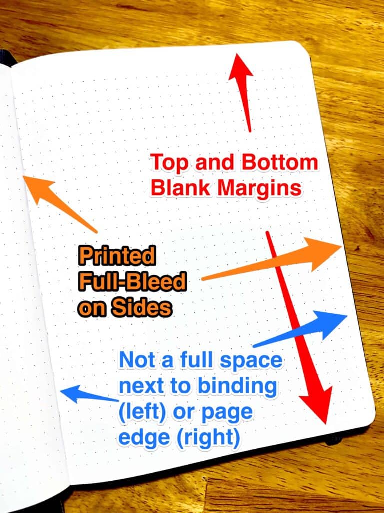
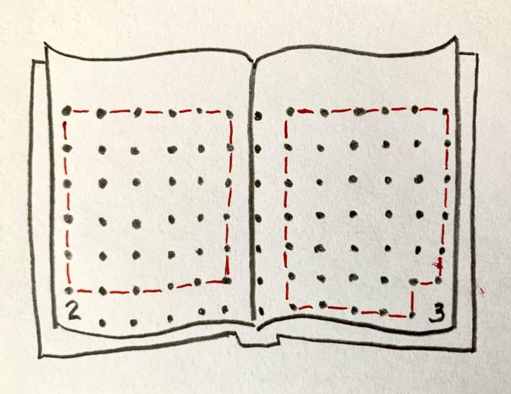
One of the most common (and most frustrating) grid journal problems is differences in margins. Some notebook and journal manufacturers don’t print dots or squares on their pages “full-bleed”. This means they might leave a blank margin at the top, bottom, or either side of each page.
If your notebook or journal has a blank margin (or margin), you could “fake” an extra column or row of spaces. Most of the time I just work with the spaces I have.
They might also print other elements on the page, like a small calendar or page numbering (see below). Sometimes they leave a neat square or rectangle of full spaces for you to use for a grid. But not always.
Parts of Spaces
A close second for most frustrating grid journal problems is when margins are non-existent. Opposite of leaving blank margins, the manufacturer might print the pattern full-bleed at the top, bottom, or either side of the page. Meaning, the dots/squares don’t end until the page edge. Depending on how the paper was cut, the page may have spaces that aren’t complete around one to all four edges.
When counting full spaces, you can’t count the cut-off spaces. They’ll leave you with uneven divisions and nowhere to write.
You can also end up with partial spaces where the pages are bound together.


Journal Binding
The binding in between your pages can get in the way. Especially when your notebook doesn’t lay flat or the page pattern is printed full-bleed. Sometimes the edge of a space (a line or column of dots) is printed so far down in the binding, you can’t get your pen down in there easily.
And even if your journal leaves a blank margin near the binding, you might want to leave an extra column of spaces out of your grid. I’ve done this often in notebooks where it’s hard to get my hand and pen that close.
Other Grid Journal Problems
Several other grid journal problems aren’t as common but are still challenging.

Page Numbering and Icons
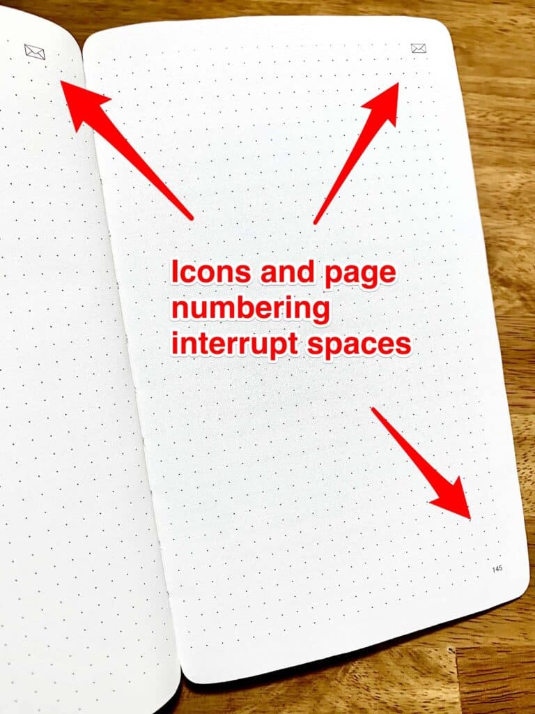
Some manufacturers, like Leuchtuurm, print page numbers in the bottom corner. This is a great time-saver. But once again, if the spaces are positioned around the numbers, you may need to leave a row or column out of your grid to give it some space.
Others may print icons or other decorations (see below).

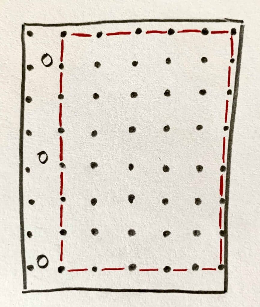

Binder Holes
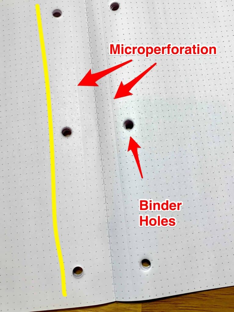
If your paper is “looseleaf” instead of being bound in a journal, there’s a good chance one long edge has been punched with holes to make it easy to add it to a binder.
Also – these looseleaf pages tend to be printed full-bleed, meaning some of your spaces will have holes in them! If this is the case, you might not be able to use several columns of spaces near the binding or rows along the top edge.
And if your paper is a tablet bound on the top edge, it may include perforations.
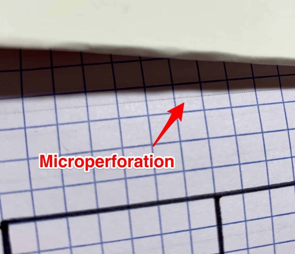

Perforations
Some companies, like Leuchtuurm, micro-perforate their pages to make them easy to tear out. Tablets (bound on one edge, usually the top), also are also often perforated.
If the pattern is printed over the top of these perforations, you might want to consider leaving the spaces beyond (and under) out of your grid.
In the example here, I started my grid a full 3 spaces away from the row of spaces punctured by the micro perf.


Decorative Elements
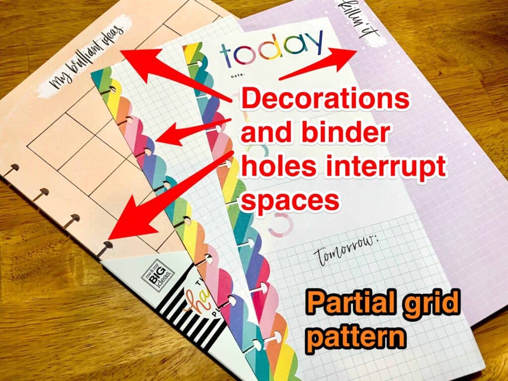
When your page has decorative elements, they can influence how much space you have to grid.
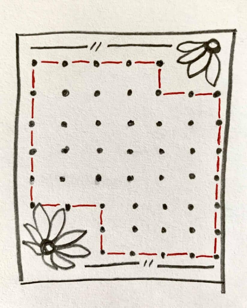
In this example, decorative elements are printed in opposite corners of the page. They obscure some of the spaces our page would otherwise have. This leaves us with an odd-shaped area with full spaces between them.
Using this example: If you wanted to make a grid 6 columns wide, you could only do so in the middle of the page. The top row and bottom 2 rows are only 4 spaces wide. Also, you’d have only 4 rows to use with your 6 columns.
Unless you moved your grid off-center. Then you could make a 4×5 grid at the top left, or a 4×6 grid at the bottom right.
The Happy Planner papers and notebooks often have decorative elements on their dot and square grid pages. You can work around them to create nice grids and layouts. But it can be a little challenging to use your ideas without modifications.
Avoid Grid Journal Problems
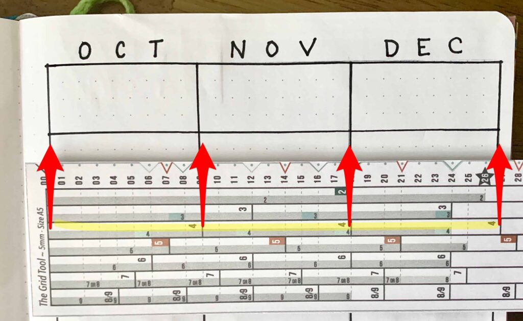

All these problems can make it difficult if not impossible to migrate layouts and grids. Especially if you’re moving from one type or size of paper to another. They also make it challenging to figure out just how much space you have to work with.
But with a smarter spacing ruler like The Grid Tool, you can let it SHOW you the possibilities. It’s easy to see where you can divide your space into even sections. Read more about how it works at How to Use The Grid Tool: Start Here
